
Practical Design Decisions Based on Current Market Trends
If you’re planning a kitchen, bathroom, or whole-home renovation in 2026, you’re facing hundreds of colour and finish decisions. This guide breaks down which choices deliver lasting value and which trends might fade quickly.
Which Paint Colours Work Best for Kitchens and Living Spaces Right Now?
The shift away from cool greys and stark whites is complete. Warm, sandy neutrals dominate successful renovations across Toronto and the GTA.
Colours That Work
Universal Khaki (Sherwin-Williams’ 2026 colour of the year) and similar warm beiges create versatile foundations. These sandy tones pair well with natural wood, brass hardware, and the textured surfaces homeowners now prefer. Unlike cool greys that can feel institutional, warm neutrals make spaces feel finished without overwhelming them.
Melodious Ivory (Dutch Boy’s selection) and similar creamy off-whites provide subtle warmth. They reflect light better than pure white while avoiding the starkness that makes rooms feel cold.
Where to Use Them
Kitchen cabinets in warm khaki create timeless appeal. These tones work equally well in traditional and contemporary designs. Wall colours in warm cream make small condos feel larger without the harsh brightness of pure white. Trim work in warm off-white provides clean contrast against deeper wall colours.
What to Avoid
Cool greys now appear dated quickly. Bright white kitchens, while still popular, require constant maintenance and can feel clinical rather than welcoming. If you prefer white, choose warm whites with cream or ivory undertones rather than stark, blue-white options.
Should You Consider Bold Colours for Your Renovation?
Deep, saturated colours work strategically when applied with purpose.
Colours Gaining Ground
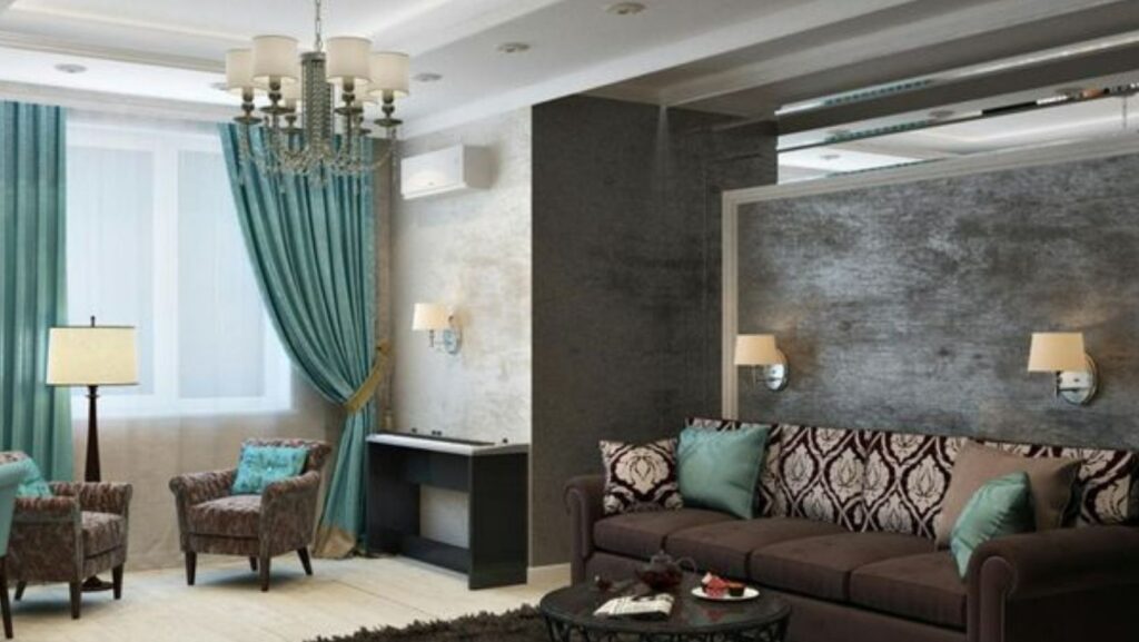
Benjamin Moore’s Silhouette (espresso-charcoal blend) creates sophisticated home offices and accent walls. Graham & Brown’s Divine Damson (deep plum) works in powder rooms, dining rooms, or bedroom accent walls. Behr’s Hidden Gem (smoky jade) suits bathrooms seeking spa-like calm.
Emerald green, chocolate brown, and deep plum all create impact in specific applications.
Strategic Placement
Use bold colours in:
- Powder rooms where guests expect memorable design
- Home offices requiring focus and professionalism
- Dining rooms benefiting from intimate atmosphere
- Bedroom accent walls creating cozy environments
- Kitchen islands as contrast to neutral cabinetry
Avoid using saturated colours on all walls in main living spaces. The trend favours strategic accent use rather than full-room applications.
Return on Investment
Bold powder rooms and home offices typically enhance property value when executed well. Bold primary bathrooms and kitchens require more careful consideration as they appeal to narrower buyer preferences.
What About Blue and Green Tones?
Cool tones return with sophistication rather than the cold starkness of previous trends.
Glacier blue and soft blue-greens create calm without sterility. These work particularly well in bathrooms where spa-like atmosphere serves functional purposes. Kitchen backsplashes in soft blue-green provide personality without overwhelming.
Smoky jades function as contemporary neutrals, shifting appearance with changing light throughout the day.
Which Textures and Finishes Should You Choose?
Surface texture matters as much as colour in 2026 renovations.
Kitchen and Bathroom Tiles
Textured tiles in uniform colours create visual interest without pattern complexity. Consider tiles in varying sizes of the same colour rather than different colours in the same size. This technique adds dimension while maintaining cohesive appearance.
Natural stone with subtle veining works better than dramatic marble patterns. Homeowners report that dramatic stone dates quickly while subtle movement provides lasting appeal.
Hardware and Fixtures
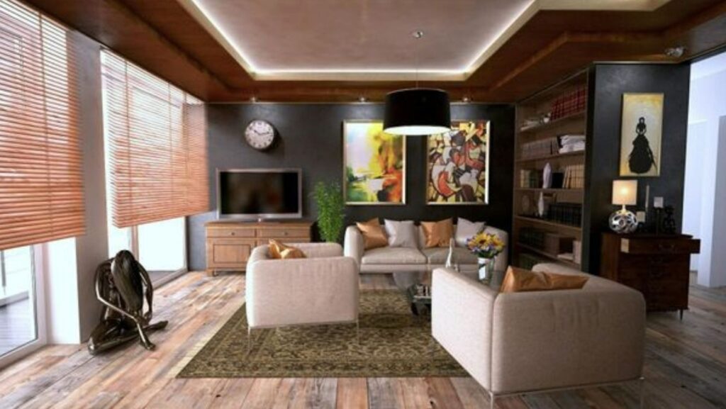
Unlacquered brass develops natural patina over time. This living finish appeals to homeowners seeking character rather than perpetual newness. Bronze and aged brass similarly provide warmth that chrome and nickel cannot achieve.
Matte black remains popular but shows water spots and fingerprints. Consider whether maintenance requirements suit your lifestyle before committing to matte black throughout.
Wall Treatments
Textured plaster finishes replace smooth drywall in higher-end renovations. These surfaces add depth and hide minor imperfections better than smooth paint. Cork wall treatments provide both texture and acoustic benefits in open-concept spaces.
Three-dimensional wallpapers incorporating sound-dampening layers work in bedrooms and home offices where noise reduction serves function beyond aesthetics.
How Should You Mix Materials and Finishes?
The requirement that everything match has disappeared.
What Works Together
Oak flooring with walnut cabinetry and brass hardware creates layered interest. White oak upper cabinets with darker walnut island base provides contrast without clash. Natural stone countertops alongside manufactured tile backsplashes combines durability with visual appeal.
Matte and glossy finishes in the same colour family add dimension. Matte wall paint with glossy trim creates subtle contrast. Matte cabinetry with glossy countertops prevents monotony.
Common Mistakes
Avoid mixing more than three wood tones in visible proximity. Two primary wood tones with one accent works better than multiple competing finishes. Don’t combine warm and cool metals in the same space. Brass and bronze work together; brass and chrome create confusion.
Should Your Renovation Follow Every Current Trend?
Not every trend suits every home or homeowner.
Trends with Staying Power
Warm neutrals work across all architectural styles and age well. Textured surfaces provide lasting interest. Quality natural materials maintain value. Flexible spaces that adapt to changing needs remain relevant.
Trends Requiring Consideration
Bold colour requires confidence and acceptance of eventual change. Highly specific aesthetics (like full-room glacier blue) appeal to narrower buyer pools. Trendy tile patterns date faster than classic formats.
Making Strategic Choices
Use lasting trends for permanent elements like cabinetry, flooring, and tile. Express current preferences through paint (easily changed), hardware (relatively affordable to update), and furnishings (portable).
Working with experienced contractors helps identify which trends suit your specific property. Toronto’s diverse housing stock means what works in a modern condo differs from what succeeds in a century home. A renovation company in Toronto familiar with local architecture and buyer preferences provides guidance on balancing current design with lasting value.
What Practical Steps Should You Take?
Before Making Colour Decisions
Test paint colours in actual light conditions. Paint large sample boards and observe them throughout the day. North-facing rooms need different colours than south-facing spaces. Artificial lighting significantly affects colour appearance.
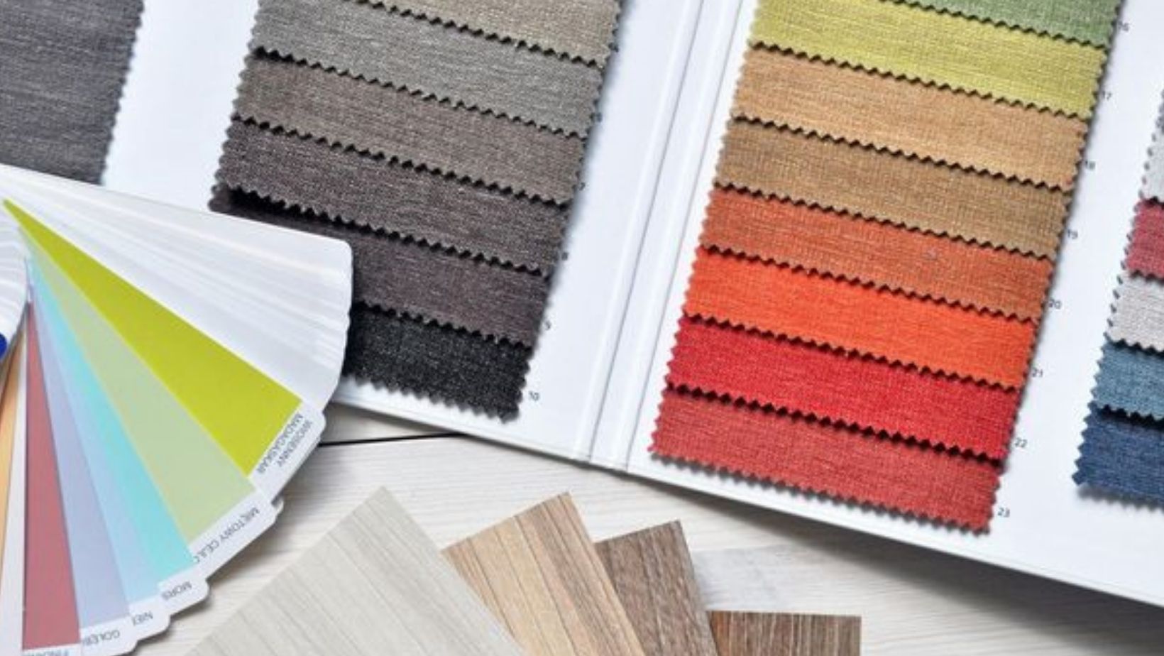
Gather physical samples of all finishes together. Colours that work individually sometimes clash when combined. Review samples in the actual space rather than making decisions in showrooms.
During Material Selection
Prioritize durability alongside aesthetics. Beautiful tile that chips easily costs more long-term than durable options. Consider maintenance requirements honestly. Some finishes require more care than others.
Think about how finishes age. Some materials develop attractive patina while others simply look worn. Choose based on which aging pattern you prefer.
Implementation Timeline
Select permanent elements first (cabinetry colour, flooring, tile) as these anchor all other decisions. Choose wall colours and hardware after permanent elements are determined. These adapt to existing selections more easily than the reverse.
How Do These Trends Apply to Specific Rooms?
Kitchen Renovations
Warm neutral cabinetry provides lasting foundation. Consider bold island colour as accent rather than committing all cabinetry to saturated hues. Mix matte and glossy finishes for visual interest. Use textured backsplash tile rather than perfectly smooth options.
Natural wood tones work for flooring and accent elements. Warm brass or bronze hardware complements warm neutral cabinets better than cool metals.
Bathroom Updates
Glacier blue or soft blue-green creates spa atmosphere without coldness. White fixtures remain classic but warm cream walls prevent clinical appearance. Textured tile adds interest in shower surrounds without pattern complexity.
Natural stone with subtle veining provides luxury without overwhelming small spaces. Brass or bronze fixtures add warmth that chrome cannot achieve.
Living Spaces
Warm neutral walls create versatile backdrops for changing furnishings. Consider tonal painting (using three shades of the same colour) for architectural interest without pattern. Bold accent walls work behind beds or in dining areas.
Whole-Home Consistency
Maintain cohesive colour temperature throughout. All warm or all cool reads as intentional. Mixing warm and cool appears uncertain. Use consistent hardware finish across visible areas for unified appearance.
Making Decisions That Last
The best renovations balance current design thinking with timeless appeal. Not every trend suits every home, budget, or lifestyle.
Focus on creating spaces that function well daily rather than achieving magazine-perfect aesthetics. Rooms designed for actual living outlast rooms designed for photography.
Consider your timeline for the space. If you plan to sell within five years, neutral choices appeal to broader buyer pools. If you’re staying long-term, express personal preference more freely.
Quality materials and skilled installation matter more than following every current trend. Well-executed classic design outlasts poorly executed trendy design every time.